
ALLENCOMM BLOG | Insights
Typography and eLearning Development; Don’t Contribute to the Arial Cliché
July 31, 2012
 When I think of ways I can improve my graphic design skills, typography is always at the top of the list (it has been for 17 years now). Since our primary tool for web-based training is Flash, we have an opportunity with each new course to improve typography and raise the visual level of online courses. Flash can embed a character set of any font you have a legal right to use into the final files. Below are a few tips I’ve given my team to improve the typography in our courses here at Allen.
Tip #1: Don’t use Arial.
Arial gets a bad rap, but one reason is that it is overused. Some may argue that its overuse is because it is the most readable, but data doesn’t support this. In fact, there isn’t much data to support any one font over another. I researched this online and in scholastic papers and came to the same conclusion as Alex Poole when he states that the argument over readability ends “in a body of research consisting of weak claims and counter-claims, and study after study with findings of ‘no difference’.”1
So if there’s truly no difference in fonts, how do you choose one? This question leads to the next two tips.
Tip #2: Find out if the elearning development client has a corporate font.
If they do, use it. This gets you around the Arial cliché. Also if you have to argue with an Arial-stalwart (sadly, yes, they exist), it gives you ammunition: “Well, it’s part of their brand.”
Tip #3: Choose wisely.
If they don’t have a corporate font, pick one you’d like to use for that client moving forward. Maybe it’s a different one for each client. Or, if fonts are too expensive, pick one to use on any and all companies you work with who don’t have a corporate font.
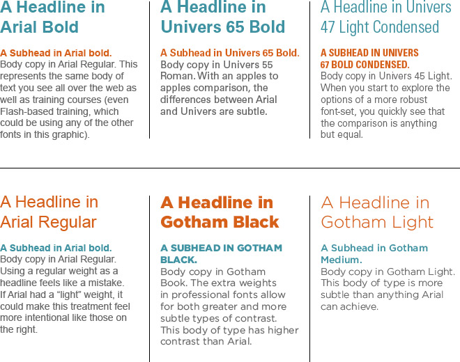
Some of my personal favorites are Gotham, Trade Gothic, and Univers. I like these fonts because they have a wide variety of weights. That’s another problem with Arial: it is missing thin, extra light, light, book, medium, heavy, and black. These are standard weights (outside of just regular and bold) that professionally created sans serif fonts provide. Another standard of these fonts is the different styles; narrow, compressed, condensed, and extended. The different weights and styles allow a graphic designer to create different forms of contrast, a wider variety of hierarchies between different types of information, and produce myriad creative solutions with a single font family. This kind of flexibility is impossible with a font that only gives you regular and bold.
Below are a few examples of what a fully-featured font can produce compared to a font with only regular and bold weights and no style options.
Learn more about our custom corporate training development.
Resources For L&D Leaders


free guide

free guide
insights | on the blog

ALLENCOMM Press Releases
AllenComm Earns Spot on Best Mobile Learning Content Providers 2026 List
eLearning Industry honors AllenComm for its custom mobile learning solutions for enterprise, built to improve performance outcomes at scale. SALT LAKE CITY, [July 29, 2026] — AllenComm has been named to eLearning Industry’s...
ALLENCOMM Press Releases
AllenComm Named a Top Employee Engagement Training Provider by eLearning Industry
AllenComm has been recognized by eLearning Industry as a 2026 top provider for employee engagement, cited for scalable, personalized L&D that drives measurable results. SALT LAKE CITY, [June 24, 2026]...
ALLENCOMM Press Releases